Lynton
Lynton is a leading UK-based manufacturer of award-winning aesthetic and medical laser systems, supplying clinics and practitioners worldwide. With an established reputation for innovation, quality, and clinical excellence, Lynton’s visual communication needs to reflect the same high standards across every touchpoint.
We were incredibly proud to partner with Lynton, supporting their internal teams with high-quality design work across exhibitions, patient-facing materials, and professional training resources, while adhering precisely to their existing brand guidelines.
Lynton
Overview
Lynton already had a strong, well-defined brand identity in place. The challenge wasn’t to reinvent it, but to apply it consistently and confidently across a wide range of materials, each with a different audience and purpose.
They needed design support for:
Exhibition materials that would stand out in busy, competitive environments
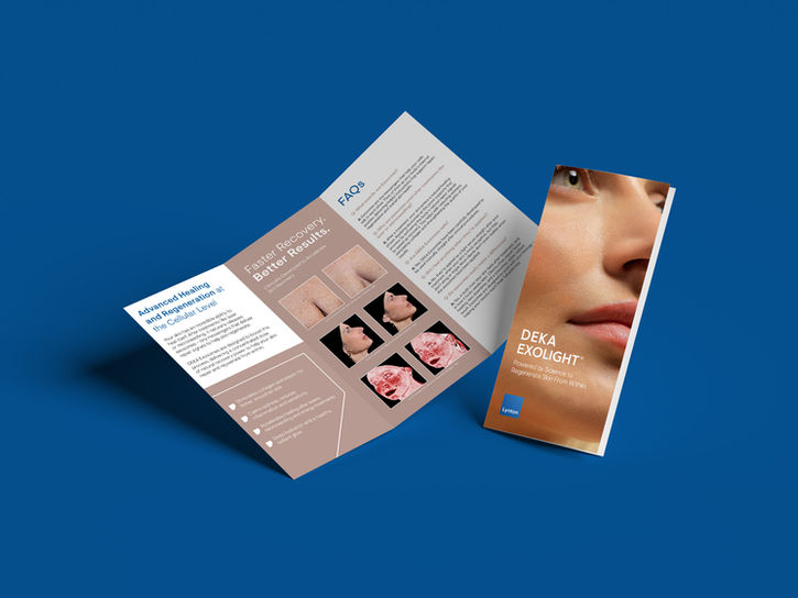
Clear, professional brochures and leaflets for patients and aesthetic partners
Interactive digital brochures to support training through Lynton Academy
All materials needed to feel unmistakably Lynton: clean, clinical, premium, and trustworthy.
Services Rendered
Brochure Design | Exhibition Artwork | Interactive Training Documents | Video Editing

Our Approach
Rather than imposing a new style, we focused on precision and consistency—working carefully within Lynton’s brand guidelines to ensure every asset felt cohesive and on-brand.
We delivered:
Exhibition Artwork
Including pull-up banners and lightbox posters designed to attract attention while maintaining a polished, professional aesthetic suitable for medical and aesthetic audiences.
Brochures & Patient Information Leaflets
Designed to clearly communicate complex services and treatments in an accessible, reassuring way, helping clinics educate patients with confidence.
Partner & Aesthetic Materials
Supporting Lynton’s wider network with materials that reflect the same high standards and brand consistency.
Interactive Training Brochures for Lynton Academy
Digitally designed, interactive brochures created to enhance the training experience, engaging, easy to navigate, and aligned perfectly with Lynton’s professional tone.
Throughout the project, we paid close attention to typography, colour, layout, and hierarchy, ensuring the brand was followed to the letter while still delivering engaging, well-considered design.
Outcome
The result is a suite of materials that seamlessly extend Lynton’s brand across physical and digital spaces. From exhibitions to training environments, every piece supports their position as a market leader, clear, confident, and professional.
Our partnership with Lynton demonstrates our ability to work respectfully within established brand systems, providing reliable, high-quality design support that complements and enhances existing identities rather than competing with them.


